Sunday, February 28, 2010

On my way home the other day, I spotted this truck. Since I happened to have my camera with me for the first time in a while, I jumped out of the car and started snapping away. It's been a couple months since I got the opportunity to get some reasonably good shots of some really good graffiti —now I know what I'll be doing on my spring break.

I've got over 1000 more graffiti photos on my Flickr page.


Saturday, February 27, 2010

The Photos of Walter Yetman

I've known Walter for a while now... probably about 5 or 6 years at least. He's one of those guys that you always see snapping pictures at shows. So what makes him different from the legions of other so called photographers out there? Oh yeah, he actually posts his work to share with the rest of the world.

How many times have you been at an amazing show, watching flashes pop left and right, only to to never see a single image of that show ever posted anywhere? He also does a good job keeping up with Bay Area graffiti, and has some interviews with writers on his blog. Follow Walter's work online at the following urls:


Thursday, February 25, 2010

Sightglass

The afterburner is in place! One step closer to Sightglass roasting their own beans! Exclamation points!!!


Saturday, February 20, 2010

More Type Experiments


In my typography class, I was given four words to work with. For this assignment, I have to physically construct, or print out my words and photograph these physical representations of the words in a creative manner. In other words, this isn't about taking a photo and slapping some text over it in Photoshop.

Since these photos need to go beyond simple snapshots, I've gotta think about some interesting ways to create photos that aren't merely simple depictions of a word. Additionally, all of the "effects" I might use need to be created in camera. At first I was skeptical about my ability to meet this requirement. I've grown really accustomed to relying on Photoshop over the years, but it's awesome to be forced out of my comfort zone and now it feels like I'm really expanding my creative limits.

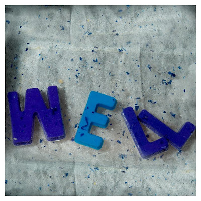
I'm happy with the results of my first experiments, but the fridge magnet letters may be a little cliche. Also, the surface that I photographed Wish on created a strange glow that makes it slightly illegible. I might experiment with some different letter forms and recreate this scene for my final presentation.


Thursday, February 18, 2010

"I know that guy!"

Graphic design is a strange thing; while it's inherently commercial and eminently visible in the world around us, it's a faceless industry. We don't know the names, let alone the faces behind the familiar graphics that surround us. One of my favorite things about studying graphic design is when you learn the identity of an artist whose work you're familiar with, but whose name and greater body of work you were previously unaware of. Some of my favorite examples of this:

Michael Schwab - michaelschwab.com


Lucian Bernhard - aiga.org/content.cfm/medalist-lucianbernhard


Matthew Carter - aiga.org/content.cfm/medalist-matthewcarter

Recently, with all the debate circling around Ikea's decision to abandon their use of Futura and begin using Verdana in their print advertisements, I couldn't help but think of how ugly a typeface Verdana is. Even in its intended environment (the computer screen) it's just an ugly looking font.

So who designed this ugly typeface? Probably some hack, right? I guess not. A few weeks ago, I was introduced to the classically informed, beautifully precise work of Matthew Carter - aka the man who created Verdana.

Pictured:
Verdana
Rocky
Mantinia